Tuesday, February 8, 2011

Principles Of Design *** Emphasis

Emphasis is a principal of design that gives a particular area more dominace and stands out against the surrounding area.

In this image, the lips are emphasized, they seem larger, are more brightly coloured so eyes are draw to it first. Also the shape of the lip is wierd which adds more emphasis to the lips.


In this picture, the rose is emphasised because the bright red rose is placed against a dull white background causing the viewers to look at the rose first.

Principles Of Design *** Porportion

Porportion in the principles of design is shown when one object seems larger than another in comparison. Porportion is also when two objects have the same ration but can be made bigger or smaller, but the ratio remain the same. 


The big dog has been blown up in porportion meaning that it is probably 5 times bigger than an original dog. Looking at this dog compared to the fence and the small cat can definitly show how porportion is used.

This picture shows a gorilla inside a jar and that the gorilla can be compared to the size of the child. Clearly no gorilla can be that small. That is how this shows porportion.

Principles Of Design *** Harmony

Harmony is when things go well with each other, for example, things that complement each other or are total opposites like the Yin and Yan.

This picture shows harmony because as you can see, they go well together and even though they are opposites (fire and water) they compliment each other and sort of like comlete each other. Without the water, the fire would be alone and seem imcomplete. 

Principles Of Design *** Symmetry

Symmetry is when a picture can be cut through the middle and both halves of the picture would be the same.
This immage is symmetrically divided at the points where the water meets land. Both sides, if it could be folded, would be exactly the same.


The Egyptian Sphinx was built so that it was symmetrical, see if you draw a line through the middle of it, both sides would be the same.


Principles Of Design *** Assymetrical Balance

Assymetrical balance is when a picture seems balanced but when you divide the page/image in half, both sides are different but the denseness and the multiple objects can balance each other out.

This picture above shows assymetrical balance. Ichose this picture because at first glance it looks like it is symmetrical but a closer look tells you that there are significant differences in the image. For example, at the bottom, one side has an avatar while the other has some deadly creature.

The waterfall shows asymmetrical balance because both sides are balanced out, one side has more waterfalls while the other side has thicker waterfalls.

Principles Of Design *** Rhythm

Rhythm is a repeted motion, something that continues at an even pace or is evenly placed. Rhythm can also play tricks on your eyes, it can make you see things that you know aren't happening.

This field above shows rhythm because the fences are evnly spaced apart to contain the green plants.

This picture above shows how rhythm can cause you to see the picture move when it isn't moving at all.

Elements Of Design *** Shape

Shape is something that is outlined to distinguish its form from the surrounding area. All shapes are made up of lines and take up space. Shapes can also show depth in an image.
In the picture above, it looks like some shapes are further back and others are more up front, so it looks sort of some of them pop- out while others hide behind each other. 

This shows shape overlapping other shapes to create more shapes. Like triangles overlapping other triangles to make circles and squares within.

Elements Of Design *** Texture

Texture is the way something looks and feels. For example: the roughness or smoothness of an object.

This picture shows how wrinkled some areas are compared to other areas. It shows how elevated some areas are and their smoothness compared to the lower areas which are rougher.

This picture shows texture because you can see the dents and roughness of the wall beside the stairs and the stairs themselves are smooth with sharp edges.

Elements Of Design *** Colour

Colour is an element of design that draws the viewers attention. Colour makes things look more appealing and therefore causes strong emotion feels. For example, red and black can make you feel really angry while sunshine yellow or sky blue can lift a persons mood. Also, it is known fact that colours can affect you phycologically!! 


In the image above, your eyes are drawn to the paint first. This is a good example of colour because it shows how the bright colours work against a black background making the paint colours pop out!

As you can see, colour can also affect you phycologically . If you state the colour, many people will just be stating the words themselves automatically and not the words themselves.


In the picture above, there is a lot of colour and is moving, because of the colours applied to this wheel, it draws the viewers attention away from other things to just the wheel itself.


Monday, February 7, 2011

Elements Of Design *** Line

 Line is an element of design that form shapes and patterns. They come in many forms, for example: loose, straight, curly, jagged and etc. The repetition of lines can cause the forming of patterns and can have emotional impact on people like confusion, anger and happiness :) 

 
This picture demonstrated the many types of lines there are, for exapmle, there are multiple wavy, jaged and curly lines. Looking at this picture sort of makes you feel confused as you try to understand the art. This would be the emotional impact the artwork would have on you.

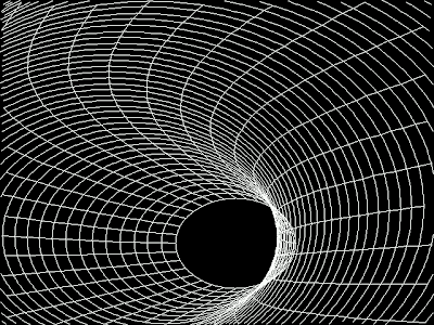
Line can also show depth as shown in the picture above, it seems as though you are in a tunnel and the black end leads somewhere, and you just want to find out. Therefore, it also causes a strong emotional feel when you look at it.